







fishisfast Redesign
Client, 2014-2015fishisfast lets people shop in the United States while living somewhere the shop refuses to acknowledge.
In 2014 and 2015 I redesigned the complete service, built the front end and ventured far enough into Rails to return with working code.
Visit fishisfast.comWhat it is
You find exactly what you need in an American shop. The price is excellent. The shop looks at your country and develops a sudden fear of geography.
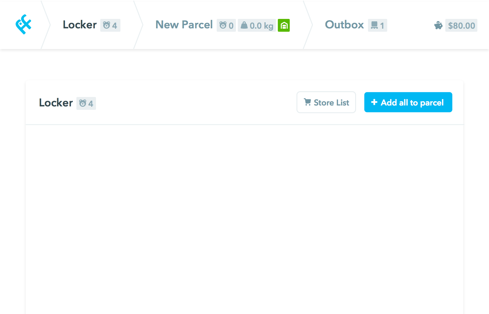
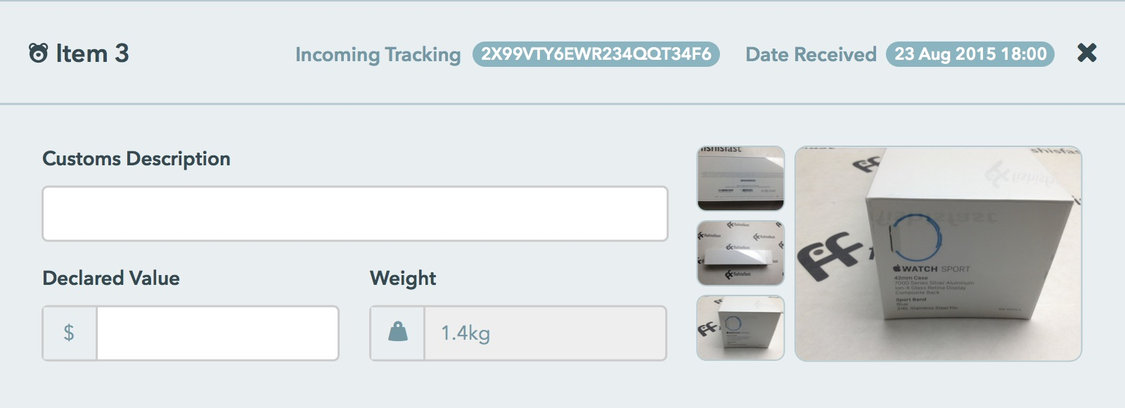
fishisfast forwards the parcel. You order to a personal address in its American warehouse, the team receives and photographs everything, then sends it to your real address.
The shop gets an American address. You get the parcel. Geography has been defeated.
Parcel forwarding asks for an unusual amount of trust. Your shopping disappears into a warehouse on another continent, gets repacked by strangers and passes through customs before it reaches you.
The site therefore had two jobs: make a complicated service simple and make every step visible. Clear pricing, parcel photos, tracking and careful explanations did more than decoration ever could.
The design brief was trust, translated into every language the parcels travelled through.
What I did
Language support
The internet is gloriously not English. Russian grows, Korean compacts, Japanese declines to use spaces and Arabic turns the entire composition around.
I built one flexible interface for Arabic, Russian, Korean, Japanese and English, including local versions of the logo. The layout learned some languages too.
 Arabic
 Cyrillic
 Korean
 Japanese
JavaScript front-page animation
Video would explain the service nicely and punish slower connections. A small JavaScript animation did the same job with images, less bandwidth and considerably more tiny flying parcels.
A comprehensive shipping cost calculator
The old calculator returned carrier names and prices. The new one explained tracking, delivery time, postage type and every other detail a person needs before sending their possessions across the planet.
Design overhaul
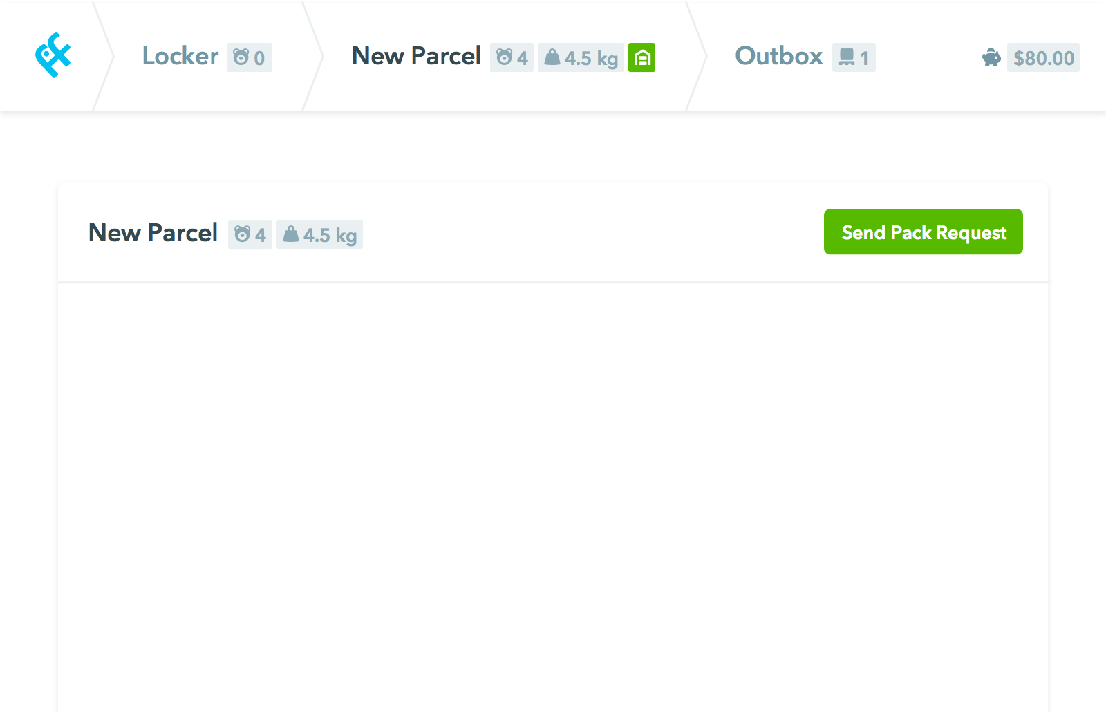
Each language had become a separate website with separate inconsistencies. We brought them into one Rails application so a new sentence no longer required an international expedition.
New marketing content
I added a shop directory, a clear service comparison and a team page with actual humans on it. Trust enjoys a face.
Onboarding & Help
A short onboarding guide showed new customers what happened next. Contextual help answered small questions before they had to become support tickets. Everybody got to keep more of their afternoon.
Mobile optimization
Most visitors arrived on phones and tablets. The old site did not. I rebuilt every screen to work on small displays, including the complicated account and warehouse tools.
What I learned
Responsive design means replacing control with rules. You cannot arrange every screen by hand, so the system has to know what matters when the space changes.
Multiple languages made those rules earn their keep:
- Russian is sometimes three times longer than English.
- Chinese and Korean take up very little space.
- Japanese doesn’t have spaces and needed manual text breaks in headers and quotes.
- Arabic reads right to left and turns the complete layout around.
fishisfast kept changing while we built it, which taught me to make small, testable improvements without interrupting a warehouse spread across time zones. Parcels do not observe office hours.