

fishisfast Redesign
Client, 2014-2015fishisfast is online shopping in the United States, for people not living in the United States.
In 2014-2015 I performed a UX overhaul of entire site, including front-end implementation and some basic work on Rails.
Visit fishisfast.comWhat it is
You need diapers. Imagine for a moment you live in Egypt or Russia. There's an amazing deal on Amazon.com, enough for 3 months and at a fraction of what you're paying every week at the local store. Sadly, Amazon.com doesn't ship to your country. So now what?
fishisfast fowards parcels from the US. You receive a personal address in their warehouse when you sign up so you to order those diapers.
You ship it to them, they ship it to you in Kazakstan.
I like that this product deals with a real problem people have; online stores in the US offer great deals but won't ship something to Korea or Brazil. Shipping outside of the US is just plain scary for some companies. It involves dealing with customs, complicated return policies and increased up front shipping costs. Most stores don't want to spend their time on that.
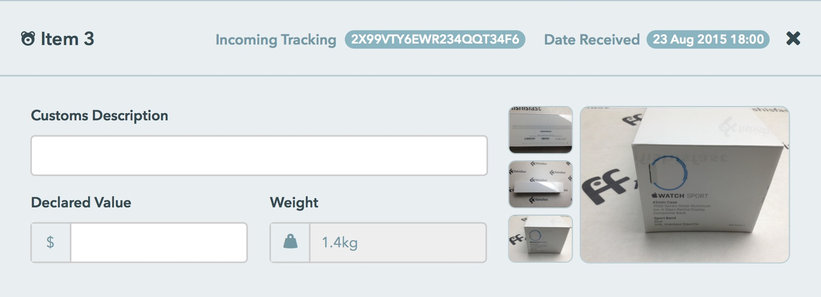
There are a lot of these reshipping services being offered. Local shipping companies like Australian Post have opened warehouses in the States, hoping for the best. It's bad. Most of the time customers only get to see the contents of their orders when it arrives at their front door. I've seen cases of parcels being repackaged (and partially destroyed) in a plastic garbage bag. And this is if the parcel arrives at all. Second and third world countries have some very untrustworthy customs and courier services.
The challenges were building a reputation & credibility throughout the site.
What I did
Language support
There is a whole other web out there that's not English. It's stuck in the past when it comes to web design and practices. Arabic is especially challenging as everything on the site is flipped left-to-right!
Large sites like Facebook are so hard to use in Arabic, people use them in English, even if they barely understand it.
There was surprisingly little information online about how to do proper design for these languages, so we set out to take a new approach to it, and we've heard users say they love it.
ArabicCyrillicKoreanJapaneseJavascript front-page animation
A good way to explain what you do is with a video, but since we're catering to some countries with very bad internet connections, Javascript animation combined with images saves bandwidth while still showing an understandable animation. Also it's just really cool to see and make.
A comprehensive shipping cost calculator
Pricing is a very popular page to visit for most websites, so making it understandable and explaining why things cost what they do is important. fishisfast had a calculator for shipping in place but it just put out a list of prices and service names. We added a slick interface and a results view where users can see the details of each shipping provider; do they offer tracking, how long will it take to arrive, private courier or public postage method etc.
Design overhaul
Each language on the site had its own website, and the information was hard to keep updated. Some text was missing in certain translations and the styling was inconsistent across all languages.
Adding more translations would only make it more messy. So we worked to combine the marketing content from separate sites into one main Rails application. It looks much better and is far easier to update.
New marketing content
We added a nice list of shops for people to browse, another page displaying the benefits of the service over others and a friendly team page.
Onboarding & Help
An onboarding wizard was added to walk users through what to do next and how to use the webapp. We also added 'help' buttons throughout the site with popup information to take some pressure off of the support team. It worked, everybody is so happy now.
Mobile optimization
Most visits to fishisfast are from smartphones or tablets, and since the site wasn't responsive, a lot of these users were lost. They couldn't navigate the site.
Combined with the design overhaul, we essentially retouched every single element and line of code on the site making everything smooth and easy to use, even on mobile. Many customers don't even have computers so this gave fishisfast a real edge over the competition.
What I learned
Responsive Design means giving up full control of how your site will look. The vast number of different screens and devices used in the world to view websites can't each be individually accounted for in your design.
You have to be smart and create a set of flexible rules that cover as much as possible, letting go of the details.
The only static element you can count on during design is the content; text and images. Dealing with multiple languages changes the text and therefore adds an extra challenge due to their unique quirks:
- Russian is sometimes three times longer than English.
- Chinese and Korean take up very little space.
- Japanese doesn't have spaces and needed manual text breaks in headers and quotes.
- Arabic flips both text and layout horizontally, from left-to-right.
fishisfast are a great bunch, constantly innovating and striving to improve their various workflows. Of course this dynamic culture means a risk of shifting priorities. Through fishisfast, I've lived the concept of ‘continuous improvement‘ and learned flexibility, maintaining a dynamic roadmap and rapid delivery of a steady stream of tested, clear modules that help the users achieve their goals.
The product's international nature has taught me a lot about designing and maintaining a robust, secure infrastructure.
With clients & teammates located in several time zones, there's never a window for any significant downtime. Implementing change without interrupting service requires clear planning. Planning both to attain the current objective and to identify potential points of failure & recovery methods. The global market also means considerable public exposure. The team has developed a solid infrastructure that protects against malicious attacks and supports variable workloads.


